Remarks:
This article is NOT financial advice. You should seek a professional before making any financial decisions.
Introduction
Technology is shaking up finance data collection, replacing dusty ledgers with dazzling dashboards.
Long gone are the days of boxy terminals and hard-to-read text as seen in the picture above.
Small business owners, take note: yfinance and Python are a great duo for analyzing your investments.
With the ability to access and visualize financial data from Yahoo in real-time, you’ll have a clear understanding of a company’s financial health before making investment decisions.
Investing with confidence has never been easier, as you’ll have heaps of information at your fingertips.
Say goodbye to guesswork and hello to smart investments.
But Why Python and Yahoo?
For starters, Python is free to use, making it an obvious choice for small business owners looking to minimize costs.
For the data, financial statistics can be difficult to obtain due to various obstacles such as limited access to reliable sources, complex and constantly changing regulations, and the need for specialized knowledge to interpret and analyze the data accurately.
Yahoo does a lot of the work for you with the stocks themselves and Python gives you a free avenue to tap into this trustworthy database. With a little bit of coding and financial knowledge, we can get an in-depth understanding of a company or index.
The purpose of this article is to inform current or prospective business owners, analyst, and programmers how to leverage yfianance/matplotlib to analyze publicly available data.
Coding
To begin, we will need to import our libraries and target which stock we want to analyze. For my example, I will be looking into Microsoft’s financial history.
import pandas as pdimport yfinance as yffrom datetime import datetimeplt.style.use('seaborn')
Above we import the libraries and style of graph we want to use, next we store Microsoft’s data in a variable.
msft = yf.Ticker("MSFT")
From there, we want an overview of Microsoft’s financial health and to put it in a variable.
stockinfo = msft.info
You will notice that this output is messy, to fix this we use a simple for loop.
#dictonary loop, prints line by linefor key,value in stockinfo.items(): print(key, ":", value)
This will give an output that is easier to digest.
If we want to return just one value from this list, we can use the following command. Feel free to change ‘sharesOutstanding’ and the variable name to match the individual value you are looking for.
#return one value from infonumshares = msft.info['sharesOutstanding']print(numshares)
The following commands showcase some of the most popular commands in yfinance to analyze data.
# get stock infomsft.info# get historical market datamsft.history(period="max")# show actions (dividends, splits)msft.actions# show dividendsmsft.dividends# show splitsmsft.splits#show current analyst reccomednationsmsft.recommendations#see major holdersmsft.major_holders
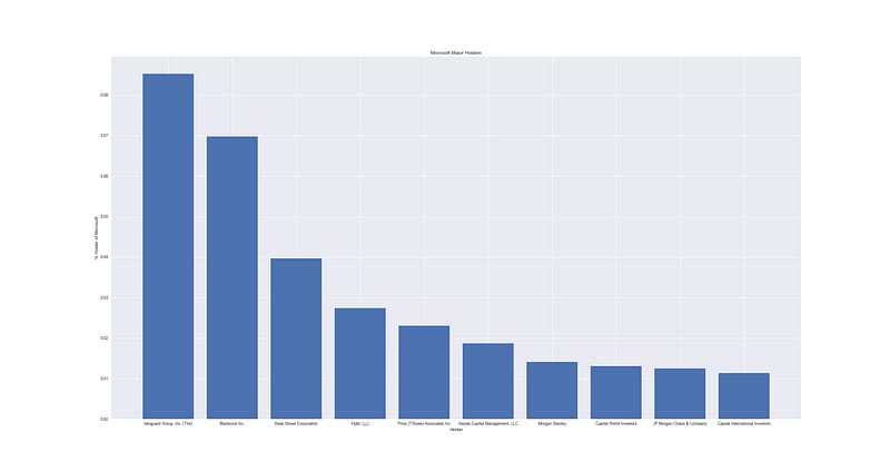
For this article, we want to see exactly who the major holders are for Microsoft.
To begin, we use the following code to extract data on those holders into a variable.
df = msft.institutional_holdersprint(df)
First Visualization
Our first visualization won’t require any data management, the data is clean enough to visualize as is.
To start our visualization, we need to import the library we will be using, matplotlib. We also want to create a figure and adjust it’s size accordingly.
import matplotlib.pyplot as pltfrom matplotlib.pyplot import figurefigure(figsize=(10,8), dpi=62) #adjust figure size here, fonts will adjust
From there, we will want to include the variables we want to use in the bar chart and label the axes accordingly.
plt.bar(df['Holder'],df['% Out'])plt.ylabel('% Holder of Microsoft')plt.xlabel('Holder')plt.title('Microsoft Major Holders')plt.show()
Result:

Second Visualization
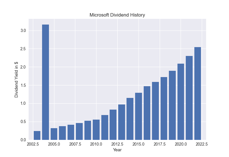
For our second visual, we will need to do some data management. For this one, we want to analyze Microsoft’s dividend history by year.
First, we store the dividends in a variable, like normal.
div = msft.dividends
From there, we want to sum the dividends by year and store it in a new variable.
data = div.resample('Y').sum()
Taking the new variable, we need to reset the index so that we can create a new column called ‘Year’, making it much easier on the eye once we graph it.
data = data.reset_index()data['Year'] = data['Date'].dt.year
From this point, we will use the same methods from earlier to create the graph.
plt.figure()plt.bar(data['Year'],data['Dividends'])plt.ylabel('Dividend Yield in $')plt.xlabel('Year')plt.title('Microsoft Dividend History')plt.xlim(2002,2023) #adjust limitsplt.show()
Result:

Please do not make any investment decisions without consulting a professional. I am not advocating for the purchasing or selling of any stock. This article exists to highlight my programming and writing skills.
Conclusion
Technology is changing the way finance data is collected, replacing manual methods with innovative visuals.
Pandas and matplotlib allows us to manage and visualize this data.
Yfinance and Python are a cost-effective solution for small business owners looking to analyze their investments.
Yfinance provides real-time financial data from Yahoo, allowing for a better understanding of a company’s financial health.
Python, being free to use, is a convenient tool for small business owners to minimize costs.
Thanks for reading!
Nick
P.S. To view the script I based this post off of, click here. Learn how to interact with the price and some more tricks.
